

Recapturing the magic of on-demand home servicing
When HOMEE On Demand first launched, it felt magical. With a tap of a button on their phone, users could request a service provider to come to their home to hang a television or fix their leaking sink. By the start of 2019, this magic dwindled due to combining additional features that made the experience slow and complex to use.
HOMEE was the leading technology platform solving key industry challenges in an over $100 billion claims market, and I was part of the progressive project to redesign its most crucial feature, the service request experience.
My Role: Senior Product Designer
My Team: One project manager, three engineers including the head of engineering, the lead QA and the CTO of the company due to high visibility of the project to the company and its new business partners.
Time Frame: Q3 2019

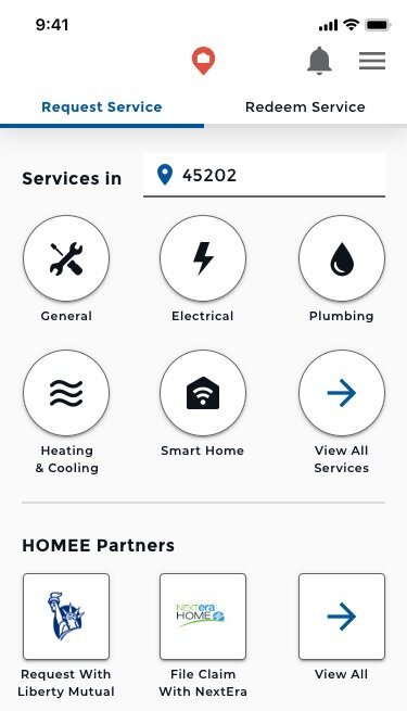
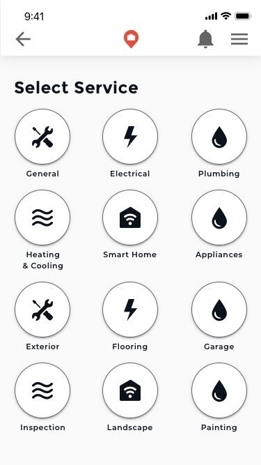
The experience prior to the re-design.


The Challenge
By 2019, HOMEE On Demand—a platform connecting users with home service providers—faced a decline in usability due to feature complexity. Users experienced slow service request processes, confusion about status updates, and unclear communication channels. These issues impacted user satisfaction and risked the platform’s market leadership in the $100 billion claims industry.
The Approach
1. Defining the Vision
Our goal was to recapture the simplicity that originally made HOMEE feel magical, while building a scalable foundation for evolving business and user needs. We aligned on three key objectives:
Make service requests fast, transparent, and user-friendly.
Create a flexible architecture to support diverse use cases (partnered product installs and insurance claims).
Prioritize affordability, time efficiency, and convenience for users.
2. Identifying Core Pain Points
Through survey analysis and interviews with service providers and customer service teams, we uncovered four critical issues:
⌛ Delayed matching times frustrated users expecting instant connections.
💳 Confusing pricing structure led to dissatisfaction with minute-based rates.
🤷♂️ Lack of status transparency caused users to doubt job progress.
💬 Unclear communication channels left users unsure whether to contact providers through the app or directly.
3. MVP-Driven Redesign
To meet tight deadlines and build from user feedback, we adopted an MVP approach, focusing on core functionalities:
Improved matching transparency with a progress bar and job request details.
Streamlined service requests for insurance claims and partnered product installations.
Simplified user flows based on analysis of ride-share app interfaces (e.g., Uber and Lyft).
How might we expand the core functionality of the job request process while maintaining a time efficient and convenient method of home servicing?

To create a more transparent matching process, I introduced a bottom sheet displaying job details and matching status during the request process. User testing revealed that adding context around the timing of the matching process significantly reduced frustration, with 10 seconds identified as the threshold for users to expect an action.
Solution and Insights
Inspired by ride-share apps, I conducted a comparative analysis of Uber and Lyft to identify key design principles, such as using progress bars for status clarity, implementing bottom sheets for overflow menus and status updates, and achieving a balance of professionalism and user-friendliness to improve user experience.
I simplified user flows by shifting the initial input to focus on the service needed rather than the address, reducing friction. Mid-fidelity prototypes were tested with insurance users, leading to the identification of a clear, winning design.


Impact
Reduced User Frustration: Post-launch data revealed a significant decrease in negative feedback related to matching delays and unclear communication.
Improved Efficiency: The new design reduced backend development time by over 80%, allowing faster integration of new partners.
Scalable Design System: The introduction of bottom sheet menus became a standard component in the design system, enhancing other app features.
Positive User Feedback: Users reported higher satisfaction with the simplified, transparent request process.
Takeaways
I designed a modular system to provide flexibility for growth, ensuring it could adapt to evolving business and user needs. By prioritizing simplicity and transparency, I addressed the core frustrations of HOMEE users and delivered user-centric innovation. Collaborating closely with engineering, QA, and customer service teams, I ensured the redesign aligned seamlessly with both user needs and business objectives.
This transformation of HOMEE’s service request experience reinforced the platform’s leadership in the claims industry and set a new standard for user-centered design in home servicing.